Gauge
Properties
Animation
Boolean value showing if the gauge should appear with an animation. False by default.
Title
Title to display above the gauge. Set to an empty string to have no title.
Width
Diameter of the gauge.
Line Thickness
Thickness of the arc.
Caption
Caption to display below the gauge.
Value
The selected numeric value of the gauge.
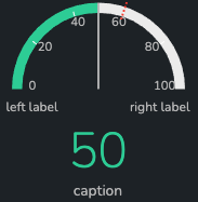
Example of a standard gauge:
Min
Number. Set's the numeric minimum of the gauge.
Max
Number. Set's the numeric maximum of the gauge.
Value Prefix
Prefix to appear in front of the value.
Value Suffix
Suffix to appear in at the end of the value.
Left Label
Label to appear below the arc on the left side.
Right Label
Label to appear below the arc on the right side.
Markers
An array of numeric markers to display on the Gauge.
The default value is an example of 5 markers spread evenly on a scale of 0 to 100:
[0, 20, 40, 60, 80, 100]
Threshold
Dotted red line to show target/threshold
Color Display
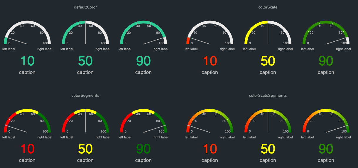
Color Display Types:
Default Colorshows the default theme color on the arc regardless of the value.Color Scalefills the arc until the value with a single color based on a color scale.Color Segmentsfills the arc with colored segments that have colors based on a specific segment value.Color Scale Segmentsfills the arc with scaled color segments based on the segment values.
Color Segments
An array of up to 5 segment thresholds and color. The segment is an array that holds a numeric value as the first value, and a string color as the second value.
The default value is an example of the red/yellow/green BCG colors spread evenly across a range of 0 to 100:
[
  [100, "#29BA74"],
  [66, "#D4DF33"],
  [33, "#E71C57"]
]
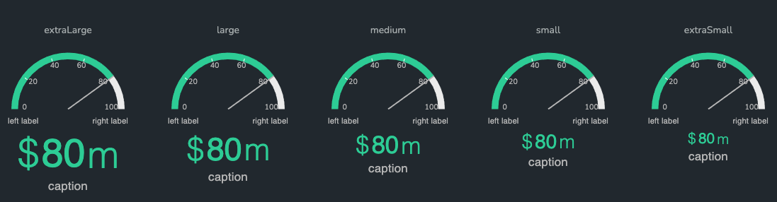
Text Size
Font size options for the value, prefix, suffix.
Extra LargeLarge(default)MediumSmallExtra Small